Showing posts with label Border. Show all posts

Monday, December 5, 2022

Which Administrations Have Performed Better with the Economy?

 A Long Introduction. (An Aside)


As readers of this blog know, I like to use primary sources of information to examine important questions. For example, is violent crime increasing along the US-Mexican border? I bring this subject up, before I get to the economy, both as an example of the detail of my work and, because I spent so many hours on it, I wanted it to again see the light of day. 

Violent Crime Rate, US, 1985 through 2014. 
FBI Uniform Crime Reporting statistics


I looked at the question of violence along the US-Mexican border through 2016, the end of the Obama presidency. 


The FBI has maintained a database of crime that began in the days of Bonnie and Clyde and which came in its current form in the 1960s. During the Trump administration this reporting was greatly cut (70% fewer tables) including many of the tables I used in my calculations. During the Biden administration the definitions of crimes were changed leading to a low reporting rate nationwide, and which made comparisons to the past into apples versus oranges. I mention these two recent changes to explain why I haven't updated the analysis since 2016 data.


For the border crime analysis, I took advantage of the fact that, through 2016, the FBI reported in detail crime statistics in all cities with a population of at least 100,000. For the US-Mexican border this meant five cities: Brownsville, McAllen, Laredo, El Paso (all Texas) and San Diego (California). I looked at violent crimes overall, along with murders and rapes as separate categories. In nearly every instance violent crimes, murders and rapes were way down (38 to 83% lower in each city) from their peak in the 90s and 00s. The one exception was the rate per population of rapes in Laredo (down 6% from its peak, but up in recent years). El Paso proved to be one of the safest cities in the country for its population.


In contrast, and I have no explanation, the three US cities with over 100,000 that border Canada, Detroit, Buffalo, and Rochester, showed an increase in violent crime. In general, across the US, while urban crime has gone way down overall, rural crime has gone way up: likely because of the shifting of the opioid epidemic to rural communities.


I'll admit I have a liberal bias going into these analyses. However, I always let the data say what they say. 


I ask questions that reflect my interests. Growing up near the Mexican border (and I did live a bit of everywhere), I was told in the seventies how the modern evil illegal aliens were criminals, not like the good ones before. My grandfather told me that people said the same thing back in the fifties when they had Operation Wetback (the official US Government name) created to cleanse the nation of Mexicans.


In my first job after graduating college, I worked with immigrants. At that time they came from Cuba, Ethiopia, Haiti and Latin America. When I griped in their presence about the crazies in the US government, they told me how wonderful the United States was. "Try living under Castro, Idi Amin, Baby Doc, etc." Their patriotism was humbling. It is sad that we are so reluctant to let in refugees from Syria, Ukraine, and other locations. These are not like past refugees, I'm told. These are modern evil ones.


Which Administrations Perform Better With the Economy?


Compared to any other analyses I've done, this one is huge. I do these analyses in my spare time and they take months for individual questions. In this case, there are lot of questions to address and I've spent years.


Firstly, there are a lot of measures of economic health. I brainstormed the following: employment/unemployment/job creation (a bundle of related subjects), change in deficit/national debt, inflation, the presence of recessions/depressions, the stock market, median income, poverty rate, tax rates. . .


Once I had the measure, I needed to find and choose a definition. This was not easy. Unemployment rate has several definitions. I am only human and did not want to do an analysis for each definition. With unemployment and other markers, I chose the most commonly used definition. I do talk about the limitations of the particular definition. 


My next task was to find the databases with the information. The US Government has kept a lot of statistics for crime (described above), and the economy. With an issue like the US debt/deficit there are a number of watchdog sites that cite the US government information but also break down the information into more detail: for example, monthly changes rather than just fiscal year or annual.


For my analysis of the stock market figures, quite a few financial investment institutions provide databases. I came across one that had the daily Dow Jones figures going back to the 1800s. Unfortunately, I lost my download and the link is broken, so my overall analyses go back to 1901. 


With this long introduction, I will begin by posting an analysis of administrations versus stock market performance. Why did I begin with stock market? My sister, the only financially successful family member out of the nine of us (siblings and parents), had me fascinated in this topic. She was a senior vice president for Morgan Stanley before her recent retirement. What can I say? She was the only one among us smart enough to drop out of college. I got a PhD.


Measuring the Performance of the Stock Market


There are three major indices (and hundreds of minor ones) that measure stock market performance: the Dow Jones Industrials, Standard & Poor's 500, and NASDAQ. With the exception of my overall analysis, I performed my study using the Dow Jones numbers.


Why the Dow Jones? The first answer is something I lean on again and again. I picked one. I could do the analysis using the Dow Jones and again using the Standard & Poor's but it would double my time. NASDAQ, triple.


Second, the Dow Jones has been around so long that I am able to look at over half the nation's history.


Third, although the Dow Jones is narrow in its focus (30 biggest stocks) and is considered inferior to the Standard & Poor's 500, over time it has maintained a remarkable correspondence with the Standard & Poor's performance.


Yes, the Dow Jones does drop businesses and does add others. So do the other indices. Only General Electric is still around from the Dow Jones' initial group. The National Buggy Whip Company is no longer relevant.*


*This is an old gag from the days of the Beverly Hillbillies. The Clampetts bought stock in the National Buggy Whip Company which suddenly became relevant again because of the mysterious new owner who bought the company at too high a price -- and who turned out to be the Clampetts. Sort of like the Musk-Twitter story. 


Compared to measures of other markers of economic growth, the Dow Jones is daily, the exceptions being weekends and holidays and several months when it was shut down at the start of World War I (and for a brief time after 9/11). Other measures of the economy are limited to once a month reports, quarterly, or even once a year. 


Dow Jones is reported as opening figures, closing figures and peak daily figures. I used opening figures although most days they usually didn't change much from the closing. Interestingly, during Obama's administration the Dow Jones never hit 20,000. It peaked at 19,999.63 on January 6, 2017. I believe I erred a few times and mixed in closing figures and introduced minor discrepancies.


Presidential Performance for Dow Jones.


I chose presidential performance as the marker. This was defined by the date of inauguration to the date of the end of the presidency, usually by stepping down, or sometimes due to death by illness or assassination. I looked at the president and president alone. 


I didn't check other political markers such as who controlled the Senate or House or both. That makes for a complicated analysis. Sometimes when the split was narrow, even a single death or resignation could change the party in charge, once in the fifties, several times within a two year period. There could have been a lot of combinations such as when a single party controlled the White House and Congress or one chamber of Congress or neither chamber. Too many possibilities / analyses.


I followed the creed of "The Buck Stops Here." Sometimes the stock market had a wonky performance due to an outside crisis that was beyond the control of the president. COVID-19, the oil crisis of the 1970s (or 2020s), etc. I didn't grade on a curve for difficulty. I wouldn't know how.


I am reporting percentage changes in the Dow Jones numbers. Absolute changes mean little to nothing. If the Dow Jones was at 200 and increased to 250, that's a 50 point ord 25% increase. That is a much better performance than if the Dow Jones was at 5000 and increased to 5100. The latter example is a 100 point increase but only 2%. Percentage changes are the only way to keep the playing field even between presidencies and different times.


First the figures for performances of all presidents who started their presidencies since 1901 beginning with Teddy Roosevelt (in September after McKinley's assassination). This first analysis looked at the whole of their terms in office. Biden's numbers are up to December 2, 2022. This analysis has 13 Republicans and 9 Democrats.


The Entire Term in Office.


The increases are additional. For example, if a number says 100%, that is doubling the number in the index.


Dow Jones

Rank, President, (party), %increased/decreased

1. Calvin Coolidge, (R), +260.6

2. Bill Clinton, (D), +225.2

3. Franklin Roosevelt, (D), +201.6

4. Barack Obama, (D), +138.3

5. Ronald Reagan, (R), +130.6

6. Dwight Eisenhower, (R), +120.4

7. Harry S. Truman, (D), +81.1

8. Donald J. Trump, (R), +56.4

9. William McKinley, (R), +52.2

10. George H.W. Bush, (R), +45.4

11. Theodore Roosevelt, (R), +45.1

12. Lyndon B. Johnson, (D), +31.5

13. Woodrow Wilson, (D), +26.7

14. Gerald Ford, (R), +23.4

15. Warren G. Harding, (R), +17.6

16. John F. Kennedy, (D), +12.5

17. Joseph Biden (as of December 2, 2022), (D), +10.4

18. Jimmy Carter, (D), +0.2

19. William Howard Taft, (R), -0.1

20. Richard Nixon, (R), -16.1

21. George W. Bush, Jr., (R), -21.8

22. Herbert Hoover, (R), -83.5


Calvin Coolidge led the roaring 20s boom and Hoover held the bag for the crash. That is not to say that Coolidge and Hoover were not, in part, masters of their opposing fates. It is generally agreed that Hoover made the depression worse. FDR performed so well in part because he started so low. Still, to give credit to FDR, he not only didn't make it worse, he much improved the situation. The invention of bank insurance restored faith in the banking system. World War II, which brought near complete employment, was not that important in helping FDRs numbers. Almost all of his increases came before the war. (more below)


Clinton was remarkable for making increases when starting from an already strong economy. Having George Bush, Sr. and Reagan as lead ins to Clinton, still did well.


I am not the first person to find that Democrats outperform Republicans in the stock market. With Coolidge, Republicans do have first place, but they also have three very bad performers taking up last place: Hoover (ending in depression), Bush, Jr. (ending in the worst recession since the depression), and Nixon. 


War doesn't appear to be good for the Dow Jones. Non-war presidents: Bill Clinton, Ronald Reagan, Calvin Coolidge, and Theodore Roosevelt were all in the top 11. Two more in the top 10, Eisenhower and Obama inherited wars and had them end (Korea for the former, for the latter one war, Iraq). Trump inherited a war, Afghanistan, which continued through his presidency. Although FDR had a remarkable increase overall (201.6%), most of this took place in his first two terms. From his third term (1941, World War II) to his death, the Dow Jones went up by 22.1%. Wilson during his second term (U.S. involvement in World War I) had a loss of -20.9%. LBJ had a 4.4% increase during his second term, during the escalation of the Vietnam War, much lower than his pre-war performance.


The Whole Term, S & P.


S & P 500


The S & P 500 began its index in 1957, so this list is abbreviated. Here's a ranking of how well the presidents have done in regards to performance.


Standard and Poor's 500

Rank, President, (party), %increased/decreased

1. Bill Clinton, (D), +209.8

2. Barack Obama, (D), +166.4

3. Ronald Reagan, (R), +133.1

4. Donald Trump (R)  +68.1

5. George H.W. Bush, (R), +51.2

6. Lyndon B. Johnson, (D), +42.5

7. Dwight Eisenhower (1957-61), (R), +36.1

8. Jimmy Carter, (D), +29.4

9. Gerald Ford, (R), +25.7

10. John F. Kennedy, (D), +19.4

11. Joseph Biden (D through December 2, 2022) 5.9%

12. Richard Nixon, (R), -19.0

13. George W. Bush, Jr., (R), -36.7


With this more recent period, we've lost the data from FDR, Coolidge, Hoover, and many of the major movers from the Dow Jones list. This has changed the rankings (fewer competition), but with the exception of Carter, who performed much better on the S & P than on the Dow Jones, the general degree of change was maintained.

The First Four Years.


To some extent, whole terms make for an unfair comparison. You may note that the above leaders were those who had been in office for more than one term. Also, such presidents such as JFK had their terms end prematurely. Why should someone who had the opportunity of over 12 years (Franklin D Roosevelt) be compared to someone who had an opportunity of less than three (Harding, Kennedy, Ford, and so far, Biden). Having found not much difference for the S & P, this analysis and the future ones are only for the Dow Jones. 


Here are how how the 17 presidents since 1900 who served for at least four years ranked when compared to each other measured at their four year time points. This list excludes Gerald Ford, John F. Kennedy, Warren Harding, and Biden.


Despite what looks like large total numbers, Trump is in seventh place, the middle being ninth place. Out of the last six presidents from Reagan on, he is ahead of Bush I and II and Reagan, but behind Clinton and Obama. 


1. FD Roosevelt (D) +255.9%

2. Clinton (D) +111.1%

3. Coolidge (R) +110.4%

4. Obama (D) +72.5%

5. Eisenhower (R) +65.8%

6. Wilson (D) +57.0%

7. Trump (R) +56.4%

8. Bush Sr. (R) +45.4%

9. Reagan (R) +32.7%

10. Johnson (D) +22.8% 

11. T. Roosevelt (R) +19.7%

12. Truman (D) +11.7%

13. Nixon (R) +10.2%

14. Carter (D) +0.2%

15. Taft (R) -0.1%

16. Bush Jr. (R) -1.1%

17. Hoover (R) -83.5%


Next time: More on the presidential comparisons looking at how the Dow Jones Index progressed during their terms so as to look at the first six months, one year, etc.


Martin Hill Ortiz is also the author of over 45 short stories, three novels, and one novellaHis epic poem, Two Mistakes, won second place in the Margaret Reid/Tom Howard Poetry Competition. He can be contacted at mdhillortiz@gmail.com. His website is mdhillortiz.com.



 

Wednesday, May 30, 2018

The Low Degree of Violence in U.S. - Mexican Border Cities

U.S.-Mexican border cities have been experiencing a historically low rate of violent crimes, at least through 2016, the most recent year with statistics available from the FBI's Uniform Crime Reports.

In my previous analyses, I looked at the recent rate of violent crimes versus the peak year. In that study I used statistics through 2014 which were the most recent numbers compiled into the city tables. Since then I discovered that the 2015 and 2016 annual reports included information for major cities.

So: this post includes the years 2015 and 2016 and rather than look at single year peaks, I compared the peak five consecutive years to the most recent five consecutive years. Being a different analysis, and less reliant on single year peaks, the numbers come out a bit differently, and are less prone to error.

To be clear: these data, the most recent available, represent crime through the end of the Obama administration and this is not a commentary on subsequent changes.

The five cities chosen were those U.S. cities that had over 100,000 in population and which border Mexico: Brownsville, McAllen, Laredo, El Paso, all in Texas, and San Diego, in California. The statistics used were total violent crime rates, murder rates and the rate of rapes, available in the FBI city tables beginning with the year 1985.

Of the cities/measurements, all 15 show lower crime rates in recent years: in most cases, dramatically lower.

Brownsville Violent Crimes. Down by 76.5%
" " Murders. Down by 88.3%
" " Rape. Down by 49.1%

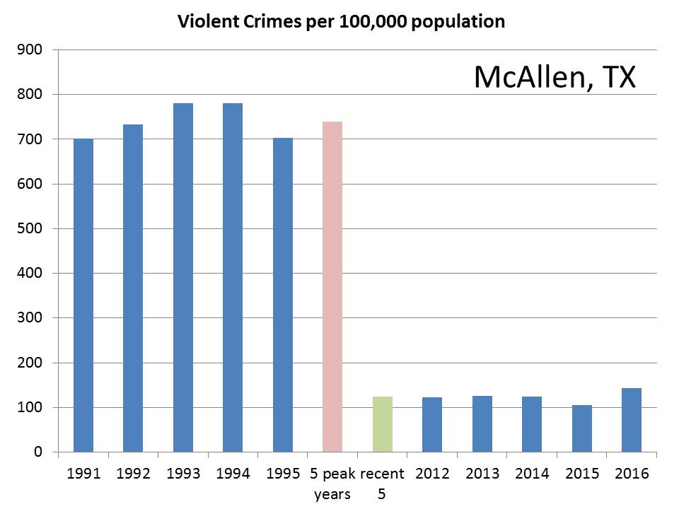
McAllen Violent Crimes. Down by 83.2%
" " Murders. Down by 67.6%
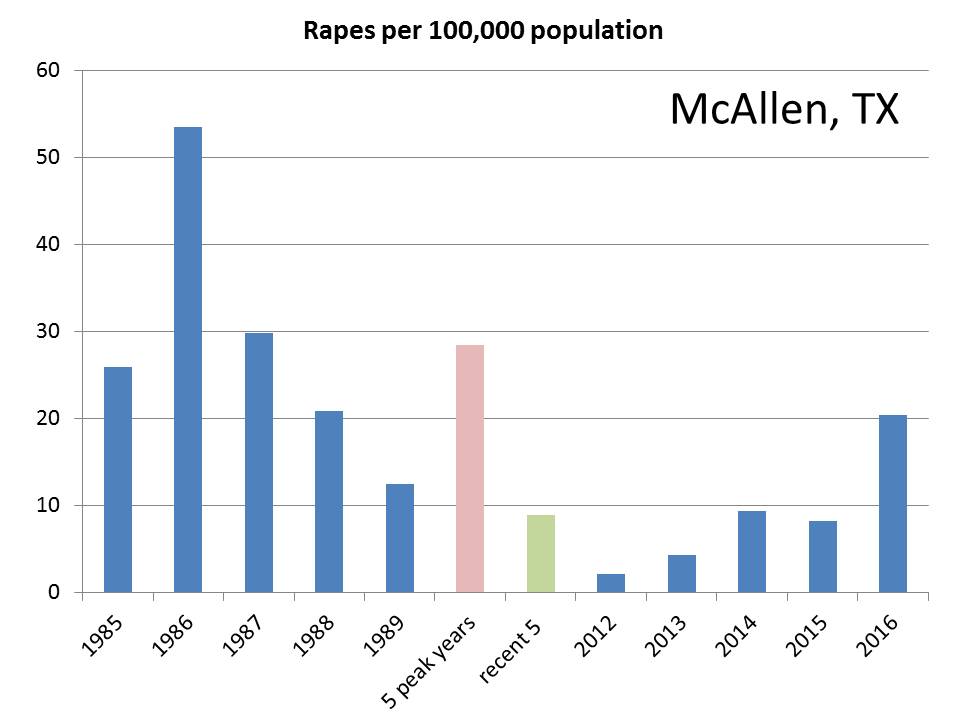
" " Rape. Down by 68.8%
 
Laredo Violent Crimes. Down by 37.7%
" " Murders. Down by 75.7%
" " Rape. Down by 6.1%

While all other city statistics show a 30% drop or more, rapes in Laredo had a negligible drop.

El Paso Violent Crimes. Down by 64.0%
" " Murders. Down by 68.1%
" " Rape. Down by 33.7%


San Diego Violent Crimes. Down by 66.7%
" " Murders. Down by 76.9%
" " Rape. Down by 32.8%

United States. Violent Crimes. Down by 49.3%
" " Murders. Down by 48.6%
" " Rape. Down by 33.7%

Four out of five of the border cities had violent crimes drop at a greater rate than the U.S. as a whole. Five out of five had murder drop at a greater (much greater) rate than the U.S. as a whole. Three out of five of the cities did equal or better in improving their rape statistics. (El Paso tied, San Diego less than one percent behind, and Laredo not doing well.) In total, according to the metrics, the border cities outperformed the U.S. as a whole in 11 out of 15 measures, with one tie.

So, here are the graphs.

Brownsville.


Brownsville, Violent Crimes per 100,000 population. The pink bar represents the average crime rate in the city's peak years of violent crime, which are shown individually in the leftmost bars. The green bar is the average for the five most recent years. FBI UCR statistics are compiled back to 1985.
------------
Brownsville Murder Rates. The legend corresponds to the one described above.
----------
Brownsville, Rate of Rape.
----------

McAllen, Violent Crime Rate.
---------
McAllen, Murder Rate.
--------

McAllen, Rate of Rape. The 2012 statistic of 2.2 per 100,000 seems an anomaly. The 2016 numbers are disturbingly high.
--------
Laredo, Violent Crime Rate.
--------
Laredo, Murder Rate.
---------
Laredo, Rate of Rape. Among the 15 sets of city statistics this one has shown marginal improvement and would even be higher if only the last two years were considered.

--------

El Paso, Violent Crime Rate.

---------
El Paso, Murder Rate.
---------
El Paso, Rate of Rape.

----------
San Diego, Rate of Violent Crimes.
---------

San Diego, Murder Rate.
----------

San Diego, Rate of Rape.

----------------
Martin Hill Ortiz is the author of Never Kill A Friend, Ransom Note Press.


Never Kill A Friend, Ransom Note Press

Never Kill A Friend is available for purchase in hard cover format and as an ebook.
The story follows Shelley Krieg, an African-American detective for the Washington DC Metro PD as she tries to undo a wrong which sent an innocent teenager to prison.

Hard cover: Amazon US
Kindle: Amazon US
Hard cover: Amazon UK
Kindle: Amazon UK
Barnes and Noble 

Martin Hill Ortiz is also the author of A Predator's Game. His epic poem, Two Mistakes, recently won second place in the Margaret Reid/Tom Howard Poetry Competition. He can be contacted at mdhillortiz@gmail.com.

Thursday, September 1, 2016

The Shift in Violent Crime Rates.

Two years ago I ran across a statistic stating that murders in Washington, DC had declined by 87% from their peak in 1991. Having lived in DC during the eighties in what my landlord referred to as "an aggressively urban neighborhood," I found this intriguing and decided to look into whether it was a general trend across the country. I found that, in the same time period, for the whole of the United States, murder rates dropped 52%. I tried and failed to get someone in the Public Health school interested in assembling a paper on this. Now, two years later, I decided to look in depth into what's going on.

Some of my findings were surprising. In spite of violent crime dropping by 50% across the United States, violent crime has been going up in the border states—the Canadian border states. It has fallen significantly in the four states bordering Mexico. I decided to test a few theories as to what is going on.

A Word About Sources.

The FBI maintains a database called Uniform Crime Reporting which looks at the numbers and population frequencies of violent and property crime. I downloaded the crime statistics by state (and the District of Columbia) going back to 1960 and started digging. [Excel files are available by request.]

First of all, I focused on crime rates (per 100,000), rather than total crimes. California should not be considered the most crime-ridden state because it has six times as many people as the "average" state. On the other extreme, Detroit should not be considered to have a drop in crime rate because of losing population.

Note: the FBI database has some quirks and limitations. The previous year's statistics are not released until late September, so the final year figuring into my calculations is 2014. The 9/11 attacks were excluded from the violent crimes statistics for 2001 which would certainly have made New York City's statistics look bad that year. This exclusion was not extended to other terrorist attacks (e.g., Oklahoma City, Fort Hood). In 2012, the definition of rape was changed which has lead to more crimes being considered rape (38.6% more rapes in 2014 using the new classification versus old). The FBI, however, also reports the number of rapes by the "legacy definition," which I used in my calculations to compare rape figures and to adjust the total violent crime figures of the last two years.

Information on the population make-up of states came from the US Census Bureau. Some were available through their "Quick Facts" section, others as part of the 2010 Census Report.

Violent Crimes, the United States as a Whole.


Violent crimes are defined by the FBI as murder and non-negligent manslaughter, rape, robbery and aggravated assault. Robbery involves the victim being present whereas burglary is when the victim is absent, the latter being a property crime. Aggravated assault and robbery dominate the statistics.


Category           Percent Total
Aggravated Assault    63.6%
Robbery               28.0%
Rape (legacy definition)      7.2%
Murder, non-negligent manslaughter     1.2%
Source.

Due to the fact that murder is such a small portion of the overall violent crimes, I decided to mostly focus on the bigger picture, violent crimes.

Violent crime rates rose drastically from 1960 to 1980 (270.8%), rose somewhat from 1980 to 1991 (27.1%), and then began a drastic decline since (down 51.8%).
Violent Crime Rate per 100,000, U.S., 1960 to 2014, from FBI, Uniform Crime Reporting Statistics.
Murder and Non-negligible Manslaughter Rate per 100,000, U.S., 1960 to 2014. Ibid.

Individual years have blips. These can be particularly significant when it comes to sparsely populated states and those with low crime rates. For example, in 1994, North Dakota had one murder, (further evidence that the Coen brothers misnamed their 1996 film) while averaging six a year for the decade. To smooth out these blips, I averaged three consecutive years together with the reported year being the central one.

The year 1992 was chosen as the reference year because this set of three years (1991, 1992, 1993) is when the violent crime levels peaked nationwide with 758.2, 757.7, and 747.1 incidents per 100,000 population, respectively, averaging out to 754.3 for these three years. The three most recent years, 2012, 2013, 2014 saw violent crimes at a rate of 386.9, 369.0 and 365.6, respectively for an average of 373.8, for a drop of 50.4%. (I will refer to these two time points as [1992] and [2013].)

Following this trend, murder rates for all of the United States have declined from 9.5 per 100,000 in [1992] to 4.6 per 100,000 in [2013], a drop of 51.6%.

The States where Violent Crime has Gone Down the Most (and Least).

Below is a map showing the change in violent crime statistics by state from 1991 to 2013. With 50 states plus the District of Columbia, the total of 51 was divisible by three and I highlighted the 17 best performing states (with the greatest reduction in crime) in lime green, the 17 worst performing in red, and the middle group in pink.

Changes in the Rates of Violent Crimes, [1992] to [2013]. The more negative a number, the greater improvement.

These are the ten states with the most improvement.

Most Improved  Percent change
 1 New York     -65.2%
 2 California        -63.3%
 3 Illinois     -61.7%
 4 Florida     -59.0%
 5 Kentucky    -57.1%
 6 New Jersey     -55.9%
 7 Michigan    -54.5%
 8 Oregon      -53.9%
 9 Maryland    -53.2%
10 Texas                  -50.1%

These are the ten states with increased violent crime rates or else the least improvement.

Worse Rates or Least Improvement
 1 North Dakota       230.3%
 2 Montana           73.8%
 3 South Dakota         63.8%
 4 New Hampshire  50.9%
 5 West Virginia         36.5%
 6 Vermont          5.6%
 7 Wisconsin           2.0%
 8 Hawaii           -3.7%
 9 Maine              -6.4%
10 Alaska       -11.0%

Because the previous map was so busy, I decided to show one which only highlights the states with the top ten best and worst performances.


Border States.

The first thing that jumped out at me were the border states. There are four states which border Mexico: California, Arizona, New Mexico and Texas. Two of these, California and Texas, are among the top ten for the greatest improvement in violent crime statistics. Arizona and New Mexico have also seen healthy improvements of -40.8% and -35.6%, respectively.

There are ten states sharing land borders with Canada (eleven including Michigan, connected by bridges). Of these, six are among the bottom ten regarding improvement in violent crime rates.

So, what's going on here?

Hypothesis one
. There is something about being contiguous with Canada that raises crime rates. For example, perhaps border smuggling (narcotics, other criminal activities) is a real problem. I looked for support of this hypothesis but I came across only general reports and sensational articles rather than a comprehensive analysis.

In favor of this hypothesis.

As mentioned above, six out of ten is a surprisingly large number to achieve by chance.

Arguing against this hypothesis.

  • New York, a border state, had the highest drop in violent crimes. Minnesota, Michigan and Washington also had sizeable drops while Idaho had a modest drop. Michigan might be a separate case. It could be that with bridge crossings, Michigan has a well-regulated border. 
  • New Hampshire and Idaho have smallish borders.
  • This hypothesis doesn't explain West Virginia, South Dakota, Wisconsin or Hawaii. (But then does one hypothesis need to explain everything?)
  • The problems attendant with North Dakota's oil boom have been well-documented and are rather unique. The rise in violent crimes, however, preceded the population boom of the mid-2000s.

Alternative hypothesis. Most of these states have something else in common besides bordering Canada.

My original observation was that the District of Columbia had a precipitous fall in murders. Compared to the 50 states, Washington, DC is the most urban (100%). In contrast, Maine, New Hampshire, Vermont, Montana and West Virginia are all among the most rural of states. My first alternative hypothesis is that violent crime rates are up in primarily rural states and down in urban states.

So, what is rural and what is urban? The United States Census Bureau pondered this question and came up with two definitions of urban and one for rural that they have used since 1990. From their website:

  • Urbanized Areas of 50,000 or more people;
  • Urban Clusters of at least 2,500 and less than 50,000 people.
  • "Rural" encompasses all population, housing, and territory not included within an urban area or cluster.

While living in cities of below 2,500 people (or not in cities at all) seemed to define rural, I decided that urban should counted as people in the urbanized areas of 50,000 or more.

So I tested this hypothesis by comparing the most poorly performing states using two standards:

Which states have the highest percentage in rural populations.
Which states have the lowest percentage in urbanized areas.

These numbers can be derived from individual state profiles from the Census Bureau (Table 2 in the linked example). Often rural and non-urban correspond to one another. In other cases, such as Alaska, Alaska is very much a non-urban state, but is the 33rd most rural.

Here is the ranking of the fifteen worse performers in the violent crime statistics, according to the ranking as being rural or least urban.


State     V. Crimes     Most Rural     Least Urban
North Dakota  1 10 13
Montana    2 5 4
South Dakota 3 7 6
New Hampshire  4 11 17
West Virginia 5 3 7
Vermont 6 2 1
Wisconsin 7 18 23
Hawaii  8 46 35
Maine 9 1 3
Alaska 10 33 10
Iowa 11 12 11
Tennessee 12 17 20
Nevada 13 48 42
Arkansas 14 6 8
Pennsylvania 15 31 34


Six out of the top ten of the worst performers were also among the ten most rural states, along with six out of ten of the least urban. West Virginia and South Dakota now fit into the explanation. Among the top ten, not fitting into either explanation are Hawaii and Wisconsin.

There has been a lot of news about rises in rural crime. I am reluctant to link to these reports, inasmuch as it seems to me to be a sort of confirmation bias.

The Decline of White Privilege.

A lot has also been written about the decline in white privilege, that is, as America has become more diverse, the relative power of being white in America has declined. I am not going to comment on the validity of the arguments, but it is hard to escape that several of the poorer performing states are among those that are least racially diverse. Among some people, the word "urban" connotes a mix of minorities. Here the most poorly performing states are compared to their ranking as being least diverse.


State     White, non-Hispanic
North Dakota  7
Montana    6
South Dakota 10
New Hampshire  4
West Virginia 3
Vermont 2
Wisconsin 12
Hawaii  51
Maine 1
Alaska 32
Iowa 5
Tennessee 37
Nevada 46
Arkansas 25
Pennsylvania 19


Now we have seven of the least racially diverse states making up the top ten, along with Iowa (number 11 poorest performer, 5th least diverse) also falling into the group, and Wisconsin nearby (7th poorest performer, 12th least racially diverse). Hawaii, the most racially diverse state, is anomalous.

So, What's the Verdict?

Frankly, rural, non-urban, near Canada and mostly white overlap with one another. It is hard to tease one from the other. Still I would submit that something worth looking into is going on here. Violent crimes, whether rural or urban, have victims. It is possible we are ignoring the dramatic increases in crime rates in Montana, South Dakota, New Hampshire, North Dakota, and West Virginia because they are lost when we look at overall crime rates.

Changes in individual states are probably strongly driven by economic forces, economic success in North Dakota and the collapse of the coal economy in West Virginia. Perhaps a change in rural economy in general is at the heart of the problem. It should be noted that notorious "rust-bucket" states and many of those that have lost considerable manufacturing jobs, did well in terms of decreasing crime.

It is possible that there is a perception of crime increasing everywhere among those who are witnessing local increases. Therefore rural states may be more susceptible to concerns about crime even though overall crime statistics have drastically decreased.


A Great Divide.

The United States has become more polarized. Some in the media play up the fear of city and this is embraced, often with an undertone of racism and superiority: big cities have crime, cronyism, and are corrupt with Boss Tweed-type politicians. In defense of their arguments they will cite the higher total crime rates although it is likely that the urban warfare seen in fictional crime shows is mixed into the view. Psychotic taxi drivers stalk the streets. Living in New York City would be horrible.

Another segment of the media depict rural America as backwards, often through the lens of a different brand of superiority. They see rural America as uncultured, intolerant and teeming with corrupt Huey Long-type politicians. They will cite how these states come in near last in markers of health, education, and income. Klansmen stalk the streets. Living in Alabama would be horrible.

Neither of these are true pictures. I've lived in the inner city and in small towns. Life goes on. Most folks are decent. There is still a large chance you will not meet with a violent crime in either place.

Interestingly, you are more likely to die from violence in rural areas. Violent accidents, particularly vehicle accidents, dominate death-by-violence statistics.

Additional Notes.

Violent crime rates versus changes in violent crime rates. To be clear, urban centers have higher violent crime rates than rural areas. Concentrating people together has this effect. However, both crime rates and changes in crime rates have stories to tell, and while the total crime in urban centers is well-discussed, I have focused on changes in violent crime rates because they tell an important additional story.

In [1992] North Dakota was 14 times safer than New York. In [2012] it was 34.9% safer.

The FBI provides stern warnings about the misuse of the Uniform Crime Reporting statistics. These warnings ask you not to take crime out of context (urbanization, poverty, etc.). These types of warnings are particularly directed to their statistics on crime in universities. In this analysis, I have tried to find context.

Don't Chase Blips.

Other than in the cases where violent crime rates steadily improve or worsen year-to-year, every year, you will have upturns and downturns. These get magnified in the press, sometimes even microblips such as single month reports in single cities are drawn out as meaningful. This is usually done with fear-mongering. Sometimes crime in one locality will go up dramatically, while in another it goes down. It either balances out and should be taken in this context, or else it will continue and become a trend. In the latter case, waiting for a multi-year change is necessary.

In line with this, I've endeavored to avoid the overtly political commentary that can come with this subject. I raised my eyebrows as to why two mostly liberal border states, Minnesota and New York have had drops in crime rates while more conservative border states did not. I didn't want to go there. What is conservative? What is liberal? Texas has certainly had more than two decades of conservative governors and has had a drastic drop in violent crime. California is a mixed bag of governance and had an even greater drop. There may be an overtly political story somewhere in these data, I didn't seek it out. It will probably not be a simplistic one.

A note for those who believe in conspiracies and doctored crime rate statistics. Yes, doctoring can occur. Some states change definitions. The FBI changes definitions over time. But to describe overall changes in this form is paranoia. There is no grand conspiracy that explains the decreases in crime rates in California, New York, Texas, Florida, etc. over a period of decades.

Continued in New York City Versus New York State.

Martin Hill Ortiz is the author of Never Kill A Friend, Ransom Note Press.


Never Kill A Friend, Ransom Note Press

Never Kill A Friend is available for purchase in hard cover format and as an ebook.
The story follows Shelley Krieg, an African-American detective for the Washington DC Metro PD as she tries to undo a wrong which sent an innocent teenager to prison.

Hard cover: Amazon US
Kindle: Amazon US
Hard cover: Amazon UK
Kindle: Amazon UK
Barnes and Noble