A Long Introduction. (An Aside)
As readers of this blog know, I like to use primary sources of information to examine important questions. For example, is violent crime increasing along the US-Mexican border? I bring this subject up, before I get to the economy, both as an example of the detail of my work and, because I spent so many hours on it, I wanted it to again see the light of day.
 |
Violent Crime Rate, US, 1985 through 2014.
FBI Uniform Crime Reporting statistics |
I looked at the question of violence along the US-Mexican border through 2016, the end of the Obama presidency.
The FBI has maintained a database of crime that began in the days of Bonnie and Clyde and which came in its current form in the 1960s. During the Trump administration this reporting was greatly cut (70% fewer tables) including many of the tables I used in my calculations. During the Biden administration the definitions of crimes were changed leading to a low reporting rate nationwide, and which made comparisons to the past into apples versus oranges. I mention these two recent changes to explain why I haven't updated the analysis since 2016 data.
For the border crime analysis, I took advantage of the fact that, through 2016, the FBI reported in detail crime statistics in all cities with a population of at least 100,000. For the US-Mexican border this meant five cities: Brownsville, McAllen, Laredo, El Paso (all Texas) and San Diego (California). I looked at violent crimes overall, along with murders and rapes as separate categories. In nearly every instance violent crimes, murders and rapes were way down (38 to 83% lower in each city) from their peak in the 90s and 00s. The one exception was the rate per population of rapes in Laredo (down 6% from its peak, but up in recent years). El Paso proved to be one of the safest cities in the country for its population.
In contrast, and I have no explanation, the three US cities with over 100,000 that border Canada, Detroit, Buffalo, and Rochester, showed an increase in violent crime. In general, across the US, while urban crime has gone way down overall, rural crime has gone way up: likely because of the shifting of the opioid epidemic to rural communities.
I'll admit I have a liberal bias going into these analyses. However, I always let the data say what they say.
I ask questions that reflect my interests. Growing up near the Mexican border (and I did live a bit of everywhere), I was told in the seventies how the modern evil illegal aliens were criminals, not like the good ones before. My grandfather told me that people said the same thing back in the fifties when they had Operation Wetback (the official US Government name) created to cleanse the nation of Mexicans.
In my first job after graduating college, I worked with immigrants. At that time they came from Cuba, Ethiopia, Haiti and Latin America. When I griped in their presence about the crazies in the US government, they told me how wonderful the United States was. "Try living under Castro, Idi Amin, Baby Doc, etc." Their patriotism was humbling. It is sad that we are so reluctant to let in refugees from Syria, Ukraine, and other locations. These are not like past refugees, I'm told. These are modern evil ones.
Which Administrations Perform Better With the Economy?
Compared to any other analyses I've done, this one is huge. I do these analyses in my spare time and they take months for individual questions. In this case, there are lot of questions to address and I've spent years.
Firstly, there are a lot of measures of economic health. I brainstormed the following: employment/unemployment/job creation (a bundle of related subjects), change in deficit/national debt, inflation, the presence of recessions/depressions, the stock market, median income, poverty rate, tax rates. . .
Once I had the measure, I needed to find and choose a definition. This was not easy. Unemployment rate has several definitions. I am only human and did not want to do an analysis for each definition. With unemployment and other markers, I chose the most commonly used definition. I do talk about the limitations of the particular definition.
My next task was to find the databases with the information. The US Government has kept a lot of statistics for crime (described above), and the economy. With an issue like the US debt/deficit there are a number of watchdog sites that cite the US government information but also break down the information into more detail: for example, monthly changes rather than just fiscal year or annual.
For my analysis of the stock market figures, quite a few financial investment institutions provide databases. I came across one that had the daily Dow Jones figures going back to the 1800s. Unfortunately, I lost my download and the link is broken, so my overall analyses go back to 1901.
With this long introduction, I will begin by posting an analysis of administrations versus stock market performance. Why did I begin with stock market? My sister, the only financially successful family member out of the nine of us (siblings and parents), had me fascinated in this topic. She was a senior vice president for Morgan Stanley before her recent retirement. What can I say? She was the only one among us smart enough to drop out of college. I got a PhD.
Measuring the Performance of the Stock Market
There are three major indices (and hundreds of minor ones) that measure stock market performance: the Dow Jones Industrials, Standard & Poor's 500, and NASDAQ. With the exception of my overall analysis, I performed my study using the Dow Jones numbers.
Why the Dow Jones? The first answer is something I lean on again and again. I picked one. I could do the analysis using the Dow Jones and again using the Standard & Poor's but it would double my time. NASDAQ, triple.
Second, the Dow Jones has been around so long that I am able to look at over half the nation's history.
Third, although the Dow Jones is narrow in its focus (30 biggest stocks) and is considered inferior to the Standard & Poor's 500, over time it has maintained a remarkable correspondence with the Standard & Poor's performance.
Yes, the Dow Jones does drop businesses and does add others. So do the other indices. Only General Electric is still around from the Dow Jones' initial group. The National Buggy Whip Company is no longer relevant.*
*This is an old gag from the days of the Beverly Hillbillies. The Clampetts bought stock in the National Buggy Whip Company which suddenly became relevant again because of the mysterious new owner who bought the company at too high a price -- and who turned out to be the Clampetts. Sort of like the Musk-Twitter story.
Compared to measures of other markers of economic growth, the Dow Jones is daily, the exceptions being weekends and holidays and several months when it was shut down at the start of World War I (and for a brief time after 9/11). Other measures of the economy are limited to once a month reports, quarterly, or even once a year.
Dow Jones is reported as opening figures, closing figures and peak daily figures. I used opening figures although most days they usually didn't change much from the closing. Interestingly, during Obama's administration the Dow Jones never hit 20,000. It peaked at 19,999.63 on January 6, 2017. I believe I erred a few times and mixed in closing figures and introduced minor discrepancies.
Presidential Performance for Dow Jones.
I chose presidential performance as the marker. This was defined by the date of inauguration to the date of the end of the presidency, usually by stepping down, or sometimes due to death by illness or assassination. I looked at the president and president alone.
I didn't check other political markers such as who controlled the Senate or House or both. That makes for a complicated analysis. Sometimes when the split was narrow, even a single death or resignation could change the party in charge, once in the fifties, several times within a two year period. There could have been a lot of combinations such as when a single party controlled the White House and Congress or one chamber of Congress or neither chamber. Too many possibilities / analyses.
I followed the creed of "The Buck Stops Here." Sometimes the stock market had a wonky performance due to an outside crisis that was beyond the control of the president. COVID-19, the oil crisis of the 1970s (or 2020s), etc. I didn't grade on a curve for difficulty. I wouldn't know how.
I am reporting percentage changes in the Dow Jones numbers. Absolute changes mean little to nothing. If the Dow Jones was at 200 and increased to 250, that's a 50 point ord 25% increase. That is a much better performance than if the Dow Jones was at 5000 and increased to 5100. The latter example is a 100 point increase but only 2%. Percentage changes are the only way to keep the playing field even between presidencies and different times.
First the figures for performances of all presidents who started their presidencies since 1901 beginning with Teddy Roosevelt (in September after McKinley's assassination). This first analysis looked at the whole of their terms in office. Biden's numbers are up to December 2, 2022. This analysis has 13 Republicans and 9 Democrats.
The Entire Term in Office.
The increases are additional. For example, if a number says 100%, that is doubling the number in the index.
Dow Jones
Rank, President, (party), %increased/decreased
1. Calvin Coolidge, (R), +260.6
2. Bill Clinton, (D), +225.2
3. Franklin Roosevelt, (D), +201.6
4. Barack Obama, (D), +138.3
5. Ronald Reagan, (R), +130.6
6. Dwight Eisenhower, (R), +120.4
7. Harry S. Truman, (D), +81.1
8. Donald J. Trump, (R), +56.4
9. William McKinley, (R), +52.2
10. George H.W. Bush, (R), +45.4
11. Theodore Roosevelt, (R), +45.1
12. Lyndon B. Johnson, (D), +31.5
13. Woodrow Wilson, (D), +26.7
14. Gerald Ford, (R), +23.4
15. Warren G. Harding, (R), +17.6
16. John F. Kennedy, (D), +12.5
17. Joseph Biden (as of December 2, 2022), (D), +10.4
18. Jimmy Carter, (D), +0.2
19. William Howard Taft, (R), -0.1
20. Richard Nixon, (R), -16.1
21. George W. Bush, Jr., (R), -21.8
22. Herbert Hoover, (R), -83.5
Calvin Coolidge led the roaring 20s boom and Hoover held the bag for the crash. That is not to say that Coolidge and Hoover were not, in part, masters of their opposing fates. It is generally agreed that Hoover made the depression worse. FDR performed so well in part because he started so low. Still, to give credit to FDR, he not only didn't make it worse, he much improved the situation. The invention of bank insurance restored faith in the banking system. World War II, which brought near complete employment, was not that important in helping FDRs numbers. Almost all of his increases came before the war. (more below)
Clinton was remarkable for making increases when starting from an already strong economy. Having George Bush, Sr. and Reagan as lead ins to Clinton, still did well.
I am not the first person to find that Democrats outperform Republicans in the stock market. With Coolidge, Republicans do have first place, but they also have three very bad performers taking up last place: Hoover (ending in depression), Bush, Jr. (ending in the worst recession since the depression), and Nixon.
War doesn't appear to be good for the Dow Jones. Non-war presidents: Bill Clinton, Ronald Reagan, Calvin Coolidge, and Theodore Roosevelt were all in the top 11. Two more in the top 10, Eisenhower and Obama inherited wars and had them end (Korea for the former, for the latter one war, Iraq). Trump inherited a war, Afghanistan, which continued through his presidency. Although FDR had a remarkable increase overall (201.6%), most of this took place in his first two terms. From his third term (1941, World War II) to his death, the Dow Jones went up by 22.1%. Wilson during his second term (U.S. involvement in World War I) had a loss of -20.9%. LBJ had a 4.4% increase during his second term, during the escalation of the Vietnam War, much lower than his pre-war performance.
The Whole Term, S & P.
S & P 500
The S & P 500 began its index in 1957, so this list is abbreviated. Here's a ranking of how well the presidents have done in regards to performance.
Standard and Poor's 500
Rank, President, (party), %increased/decreased
1. Bill Clinton, (D), +209.8
2. Barack Obama, (D), +166.4
3. Ronald Reagan, (R), +133.1
4. Donald Trump (R) +68.1
5. George H.W. Bush, (R), +51.2
6. Lyndon B. Johnson, (D), +42.5
7. Dwight Eisenhower (1957-61), (R), +36.1
8. Jimmy Carter, (D), +29.4
9. Gerald Ford, (R), +25.7
10. John F. Kennedy, (D), +19.4
11. Joseph Biden (D through December 2, 2022) 5.9%
12. Richard Nixon, (R), -19.0
13. George W. Bush, Jr., (R), -36.7
With this more recent period, we've lost the data from FDR, Coolidge, Hoover, and many of the major movers from the Dow Jones list. This has changed the rankings (fewer competition), but with the exception of Carter, who performed much better on the S & P than on the Dow Jones, the general degree of change was maintained.
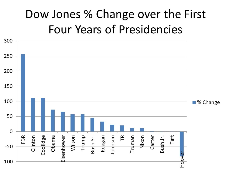
The First Four Years.
To some extent, whole terms make for an unfair comparison. You may note that the above leaders were those who had been in office for more than one term. Also, such presidents such as JFK had their terms end prematurely. Why should someone who had the opportunity of over 12 years (Franklin D Roosevelt) be compared to someone who had an opportunity of less than three (Harding, Kennedy, Ford, and so far, Biden). Having found not much difference for the S & P, this analysis and the future ones are only for the Dow Jones.
Here are how how the 17 presidents since 1900 who served for at least four years ranked when compared to each other measured at their four year time points. This list excludes Gerald Ford, John F. Kennedy, Warren Harding, and Biden.
Despite what looks like large total numbers, Trump is in seventh place, the middle being ninth place. Out of the last six presidents from Reagan on, he is ahead of Bush I and II and Reagan, but behind Clinton and Obama.
1. FD Roosevelt (D) +255.9%
2. Clinton (D) +111.1%
3. Coolidge (R) +110.4%
4. Obama (D) +72.5%
5. Eisenhower (R) +65.8%
6. Wilson (D) +57.0%
7. Trump (R) +56.4%
8. Bush Sr. (R) +45.4%
9. Reagan (R) +32.7%
10. Johnson (D) +22.8%
11. T. Roosevelt (R) +19.7%
12. Truman (D) +11.7%
13. Nixon (R) +10.2%
14. Carter (D) +0.2%
15. Taft (R) -0.1%
16. Bush Jr. (R) -1.1%
17. Hoover (R) -83.5%
Next time: More on the presidential comparisons looking at how the Dow Jones Index progressed during their terms so as to look at the first six months, one year, etc.
Martin Hill Ortiz is also the author of over 45 short stories, three novels, and one novella. His epic poem, Two Mistakes, won second place in the Margaret Reid/Tom Howard Poetry Competition. He can be contacted at mdhillortiz@gmail.com. His website is mdhillortiz.com.